Don’t judge a book by its cover, goes the adage. But magazine readers do it all the time.
In the highly competitive periodical industry, the cover is all-important. It’s that hook that can make a publication stand out from all the others on crowded newsstands, inspiring potential readers to pick it up and, hopefully, buy it.
The cover, say marketers and editors alike, is the most important page of the magazine. If it doesn’t grab a shopper in three seconds, goes the rule, it won’t grab them at all.

The graphic designers at Canvet Publications, publishers of Legion Magazine and the quarterly Canada’s Ultimate Story series of special editions, usually produce up to a dozen cover designs for each issue. If the preferred ideas turn out to be a particularly close call, the top two are put out on the website and social media to a public vote.
The winner is usually the one that ends up in print. Usually.
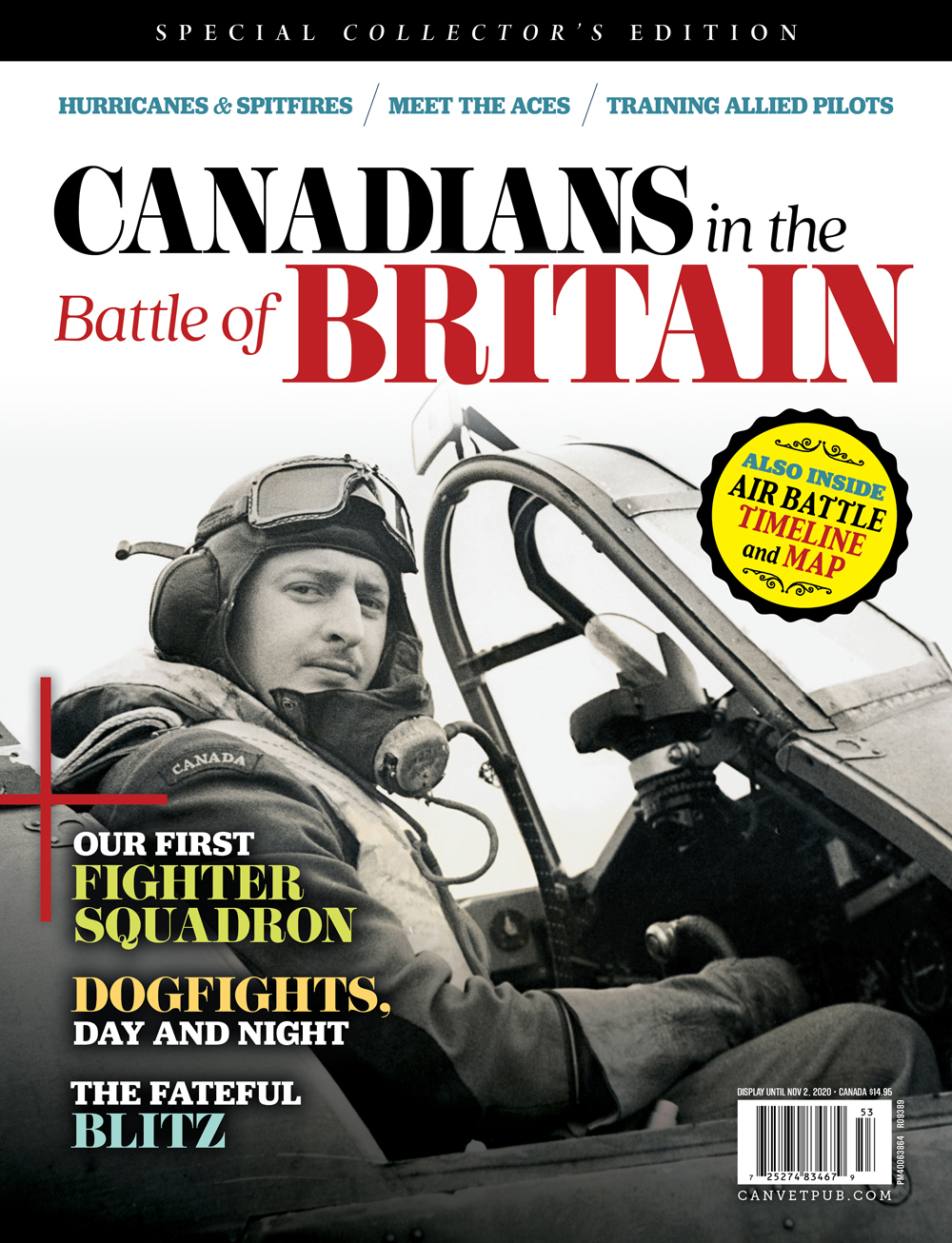
In the case of Canadians in the Battle of Britain, Canvet’s latest special issue, the most popular cover in the public vote—and the one Canvet’s cover consultant recommended—did not make the cut.
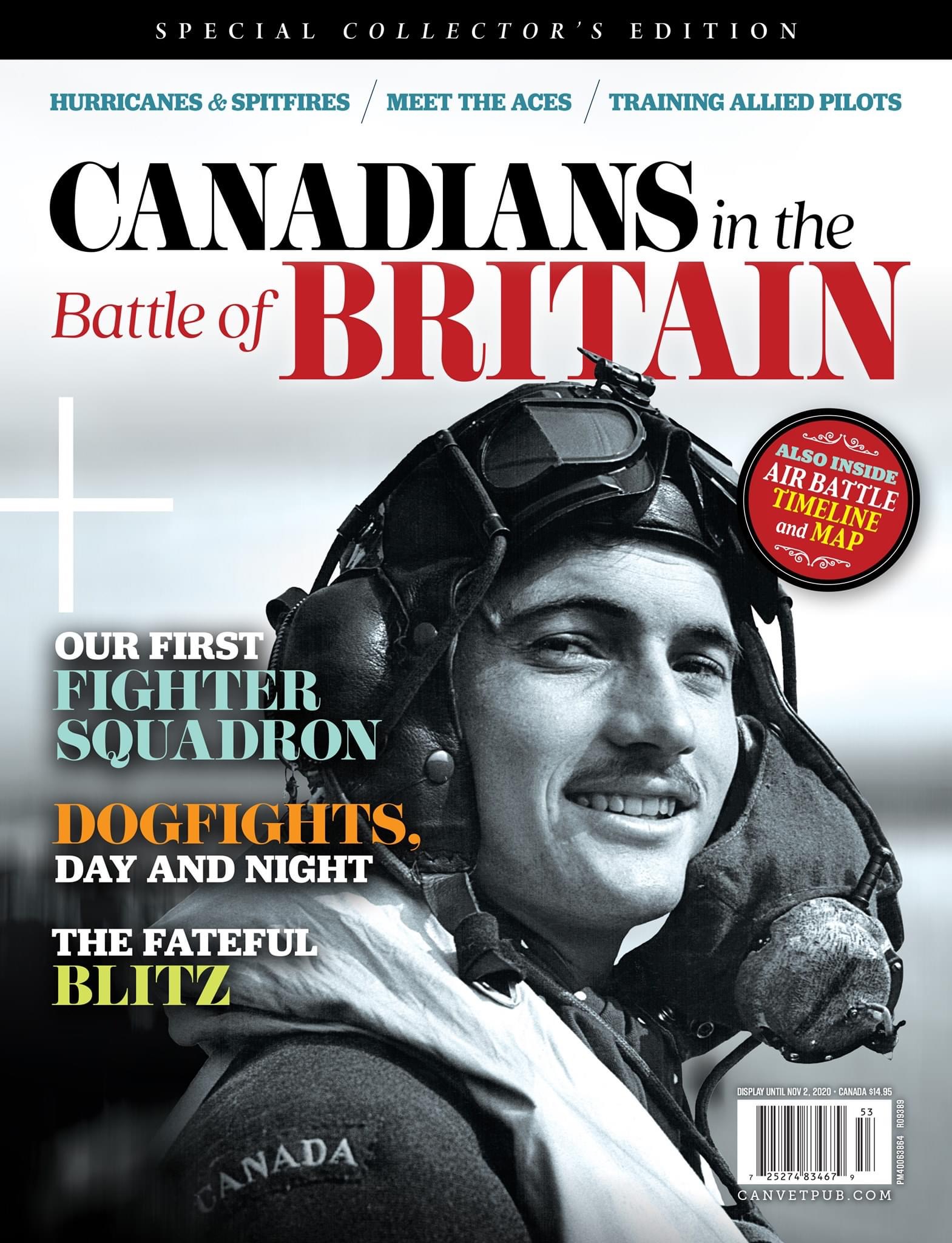
In a last-minute turn, the picture of a pilot perched in the cockpit of his Hurricane in 1940 (top) was replaced with the second choice (below): a headshot of a moustachioed, swashbuckling Canadian pilot in flying helmet and goggles gazing straight into the viewer’s eye sporting a confident, if not cocky, grin reminiscent of Errol Flynn or Clark Gable.
The picture, said Canvet general manager Jennifer Morse, reflects a confidence, an optimism typical of fresh new pilots of the day, and is bound to be welcomed in these pandemic times. It was a familiar look to Morse, an air force brat who grew up on bases throughout her young life.
“That look is not inconsistent with the pilots who used to come into the bar that I served in all the time,” she said. The average life expectancy of an Allied pilot in the Battle of Britain was four weeks, among the highest mortality rates of the war.
Like Canvet’s special edition on Normandy, which featured a helmeted young soldier embarking on what he no doubt thought would be a grand adventure, the Battle of Britain cover evokes hope and confidence.
The individuals on each cover, Normandy and Britain, “almost look innocent,” said Morse. “They’re going off to probably the most horrific thing we can do to each other and it’s like they’re going on a big adventure.
“It almost captures that moment before they lose their innocence.”
The first Battle of Britain cover, she said, reflected what she described as the “haunted” look of a battle-weary fighter.
Newsstand consultant Scott Bullock had preferred it over its grinning rival. The pictured pilot was more serious, evoked more gravitas, better reflected the stresses of combat flying. The picture was completed by the fact it included the plane.
But for Morse and editor Eric Harris, the decision to go with No. 2 was a simple one, coming after it was discovered during research for caption information that the first pilot, identified by the Alamy stock photography service as a native of Regina, was actually an American volunteer serving with No. 1 Squadron, RCAF.
Nothing against Americans, mind you, but the publication, after all, is titled Canadians in the Battle of Britain. Had we not done our due diligence, someone among Canvet’s keen readership would undoubtedly have pointed out that the pilot on its latest cover stood—or sat—in direct conflict with the purported subject matter and called us on it.
“That’s minefield No. 1 for us,” said Harris who, between daily newspapers, Canadian Geographic and Legion Magazine, has worked in publishing for 40 years. “The caption info that comes with the picture is not always correct.
“This is probably the perfect example of that fine line between an image that helps us sell the issue but compromises our integrity,” he explained.
“We have a headline that says Canadians in the Battle of Britain so we pretty much have to have a Canadian on the cover. Otherwise, we’re bending the rules, cheating the reader, and we just can’t do that.”
The pilot in question remained anonymous after an Internet search for his name proved futile. As a last resort, I posted the picture on the Facebook page marking the squadron’s 100th anniversary, asking followers if anyone knew who it was.
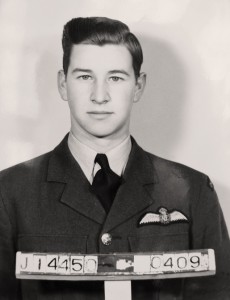
Chief Warrant Officer François Dutil of the RCAF based in Longueuil, Que., came back with the name F/O Pete Brown. Asked if he could confirm it, he sent along the same picture—only this version was the original from the squadron archives, donated during a 1984 reunion, the name F/O Pete Brown written in ink, “as entered by original wartime aircrews.”
“I think you can take that information to the bank,” Dutil wrote.
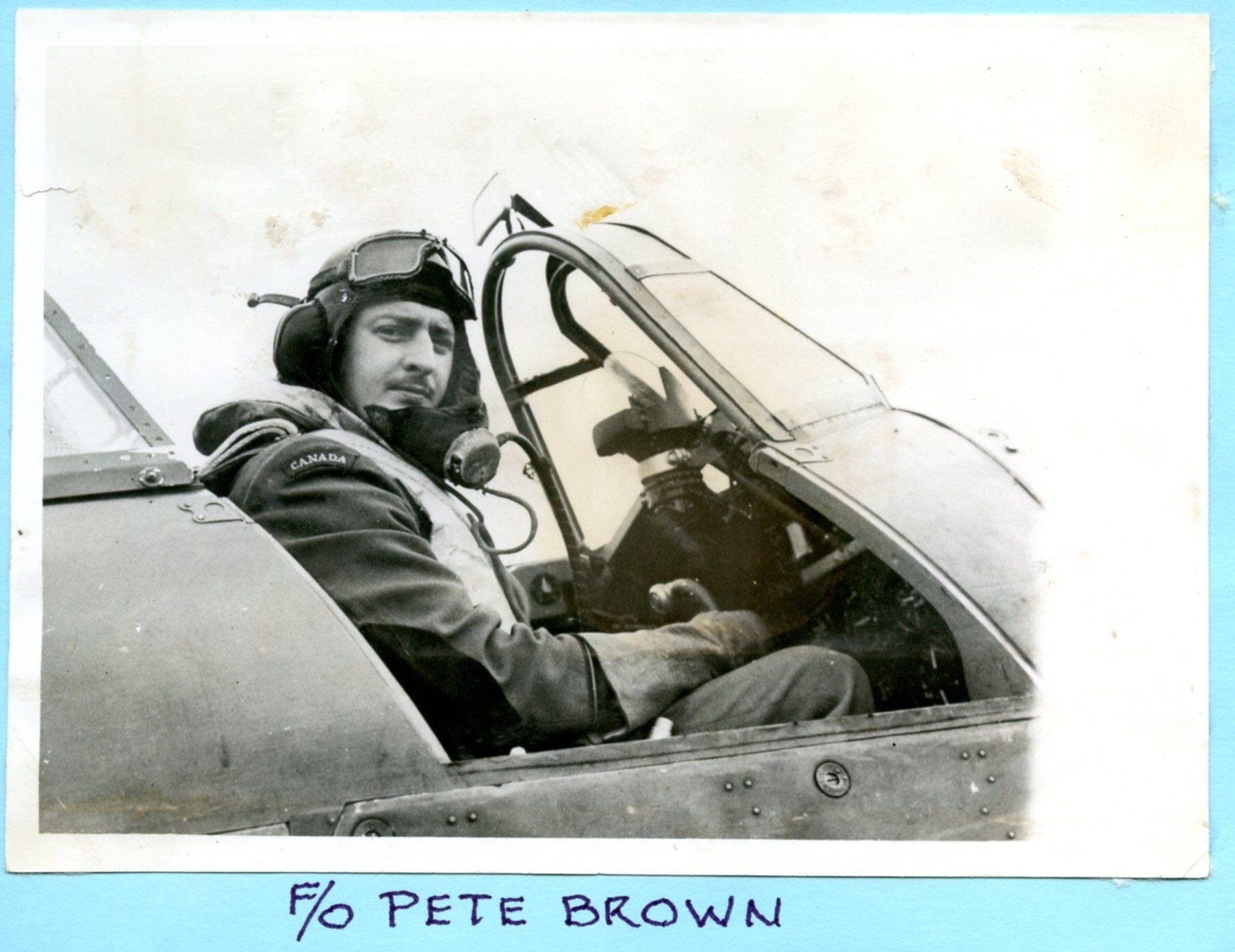
A little follow-up research by both of us quickly confirmed his identity as that of De Peyster Douw (Pete) Brown, DFC, from Santa Maria, Calif., and born in Pennsylvannia. Having signed up on Sept. 9, 1939—probably in Regina—he would go on to fly Lysanders with 112 Squadron, RAF, before transferring to No. 1, RCAF, on Sept. 2, 1940, right in the thick of the Battle of Britain. Piloting a Hurricane, he shot down a Dornier Do-17 and shared in the destruction of a Junkers Ju-88 on Sept. 27.
Brown transferred to the United States Army Air Force in May 1942 and would ultimately attain the rank of major. He flew in the Berlin relief airlift and is also believed to have served in Korea. Master Corporal James Ferris, a keeper of the No. 1/401 squadron heritage, found another picture of Brown playing chess with a pilot from 303 (Polish) Squadron, RAF, which was commanded by John Alexander (Johnny) Kent of Winnipeg, also known as “Kentski.”
Brown’s original cover image is included inside Canadians in the Battle of Britain, on page 57. Little could be found about the pilot who replaced him on the cover. The Getty stock service identified him only as “a Canadian Hurricane pilot in flight gear, International Regiment, Canada, circa 1939-1945.”
An extensive search, including exchanges with private collectors, took it no further. The subsequent caption made no claims about his identity, focussing instead on Canada’s rich flying heritage entering the Second World War.
“We just don’t always discover everything at the front end in this business,” said Harris. “We discover errors all along the process right to the last day before the magazine goes out.”
The subject matter—history and war—is fraught with imprecision. The fog of war, the politics of war, and war itself, are not kind to clarity and truth. In an era in which “fake news” has become a catchphrase, the industry in general is arguably more consumed with verification and fact-checking than it has ever been.
Verifying the historical record has always comprised a disproportionately large part of what Canvet editorial staff do.
“We’re constantly clarifying factual information,” said Harris. “It sounds pretty pedantic but it results in a magazine experience that doesn’t trip the reader up. As soon as the reader stops and says ‘hmm, I don’t think that’s right,’ you’ve lost them.”
Sometimes, cover choices have less to do with content than sales appeal. Vanity Fair’s August 1991 cover of a pregnant and nude Demi Moore sold 1.2 million copies, up from the usual 800,000, even though the issue contained far more substantive pieces on child murders, Saddam Hussein and tensions between Los Angeles police and the Black community in the wake of the Rodney King beating.
Bullock says the church-and-state divide between magazines’ circulation and editorial staff used to be more pronounced than now, when the industry is competing with the Internet and other media for readers’ attention.
Thus, sales appeal in cover design counts more than ever.
Over the course of countless seminars, Bullock has developed 35 rules for magazine covers, among which “subject matter matters” is No. 1, meaning that whatever the editor decides is going to be the cover feature matters more than the actual design.
On balance, said Bullock, the primary indicator of success boils down to what the subject matter is about. Broad appeal is more important, he explains, than what may be of interest to a small group of, say, historians, academics and intellectuals.
Then, and only then, can the tricks of the art director’s trade work their magic to maximum effect.
And there are all kinds of tricks to help a cover stand out among the crowd. Placement is a big one, but it can be costly to get preferred spots on newsstands. So specialists like Bullock and designers have come up with little tweaks to enhance the subject matter and help bring those readers in.
“There is a wealth of magazines out there,” said Morse. “And often magazines are placed behind or beside or underneath other magazines. So there are certain areas on the magazine cover that we consider prime real estate.
“The top bars, the side bars, that centre position—it depends on where it is on the rack. You really need to carefully use edges and you need to be able to create a poster, a marketing poster for Legion Magazine, where it either resonates or it’s gone.”
Circulation specialists like Bullock understand the numbers better than anyone, and the numbers, as they say, don’t lie.
“The numbers don’t have egos,” he says. “Whereas human beings, whether they’re art directors or editors, do because they’re just heavily invested in their own creations. They’re primates; that’s just how we are.
“Circulators tend to approach things as ‘what are the numbers telling me.’ We just don’t get as caught up in it because our souls are not invested in it in the same way that an art director’s or an editor’s is. The numbers are what drive us.”
All that to say, Bullock maintains that while he understood the decision to go with the second choice, he still preferred the Brown cover, even though the subject was an American.
“The second cover is still great,” concedes Bullock, who has spent four decades advising magazine publishers and editors on cover art. “We’ll still do really well with it.”
On his blog, coverssell.com, the expert writes that the cover of Canadians in the Battle of Britain “has all the hallmarks of what works…great subject matter…strong use of left hand ‘real estate’…good use of colour for other sell lines.”
“Watch this one sell!” he added.
Canadians in the Battle of Britain, the latest edition of Canvet’s Canada’s Ultimate Story series, is on newsstands now.

Advertisement


